
Colour is information. Black and white is emotion. The deliberate removal of colour from a photograph strips the image to its essentials — light, form, texture, and tone — forcing both the photographer and the viewer to engage with the subject in a more fundamental way. Not every image benefits from this treatment, but for those that do, black and white can be profoundly powerful.
When Black and White Elevates the Image
High-contrast scenes: Images with strong contrast between light and shadow — a shaft of light in a dark alley, a backlit silhouette, a face lit by a single window — translate exceptionally well to black and white. The absence of colour sharpens the drama of the tonal extremes.
Texture-rich subjects: The bark of an ancient tree, weathered stone, wrinkled skin, the weave of linen — texture becomes the star of a black and white image in a way it cannot when competing with colour.
Emotional or timeless subjects: Documentary and photojournalistic images often benefit from black and white, which lends a sense of gravity and historical weight. Grief, struggle, joy, and quiet contemplation are frequently better served without the distraction of colour.
Distracting or clashing colours: If the colours in your image are competing with each other without adding meaning — a red bin in an otherwise atmospheric street scene, for example — converting to black and white removes the distraction and allows the composition to breathe.
The Zone System: Thinking in Tones
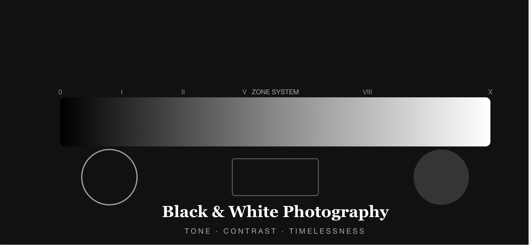
Ansel Adams’ Zone System divides a tonal range into eleven zones, from pure black (Zone 0) to pure white (Zone X), with Zone V representing middle grey. When composing and processing black and white images, think consciously about tonal placement: where are your deepest shadows, your brightest highlights, and your midtones? Great black and white photography is essentially a study in the management of tones.
Processing Black and White in Lightroom
Never simply desaturate a colour image. Instead, use Lightroom’s B&W panel to adjust the luminance of individual colour channels. Increase the Red channel to lighten skin tones; decrease the Blue channel to darken skies dramatically; increase the Orange channel to add warmth to midtones. This selective control over tonal values is what separates a rich, nuanced black and white image from a flat, lifeless one.
“When you photograph people in color, you photograph their clothes. But when you photograph people in black and white, you photograph their souls.” — Ted Grant
Conclusion
The decision to shoot or convert to black and white should always be a considered one. Ask: does removing colour strengthen or weaken this image? Would colour add meaning, or create noise? Let the answer guide your choice.